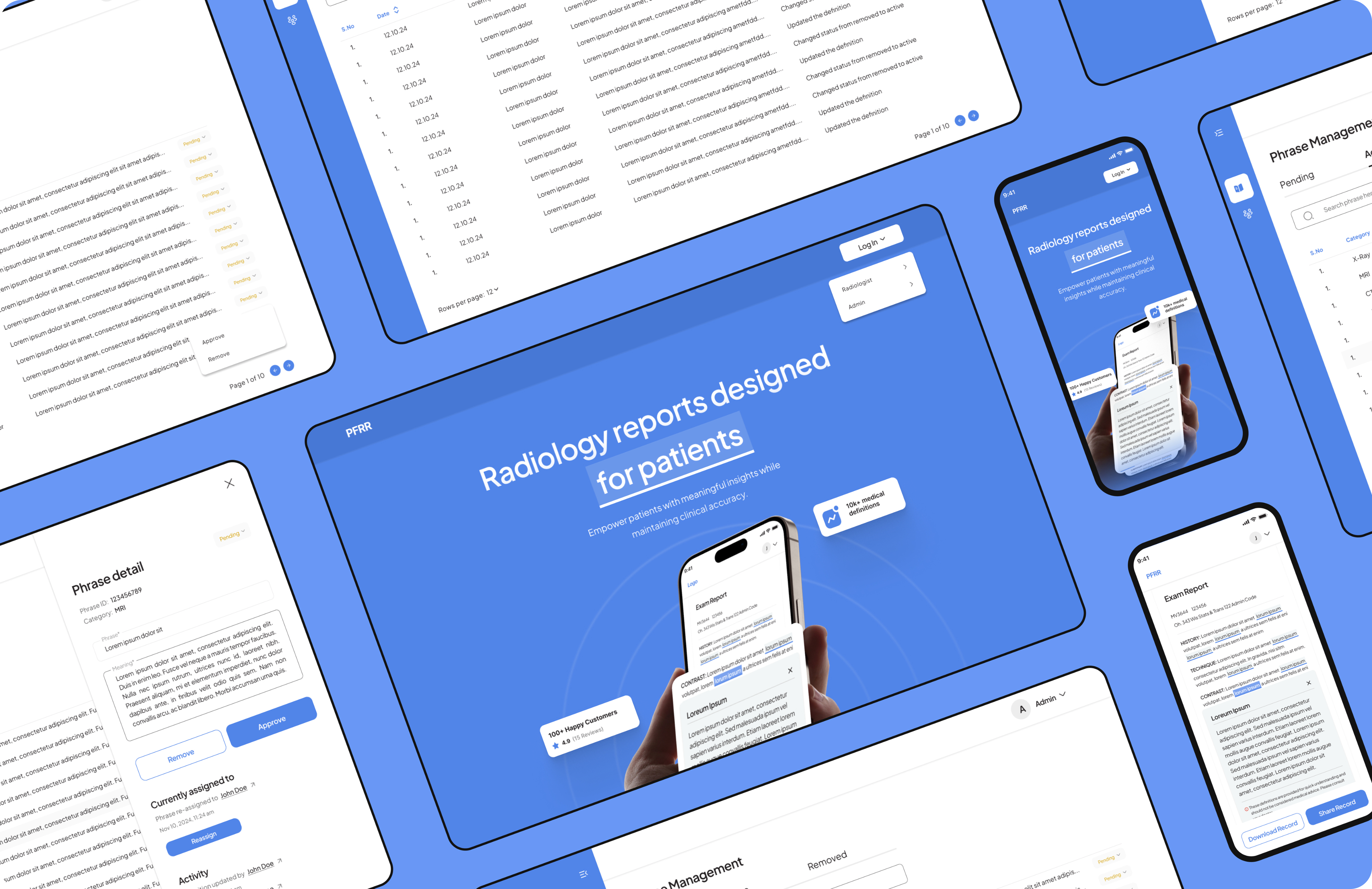
Empowering patients with smarter medical understanding
Where smart money gets smarter.
Timeline
2 months
Responsibilities
UX/UI Design
Development
Category
Meditech
Country
Canada
Overview
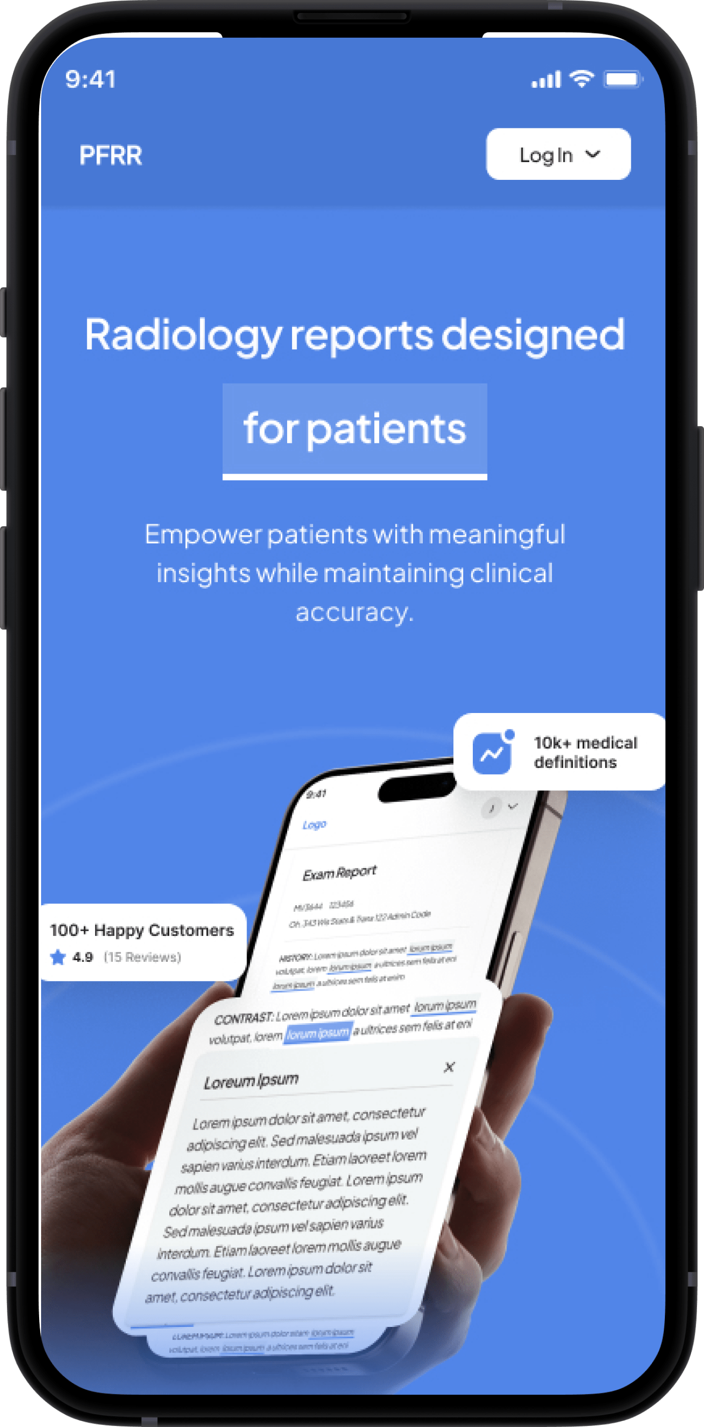
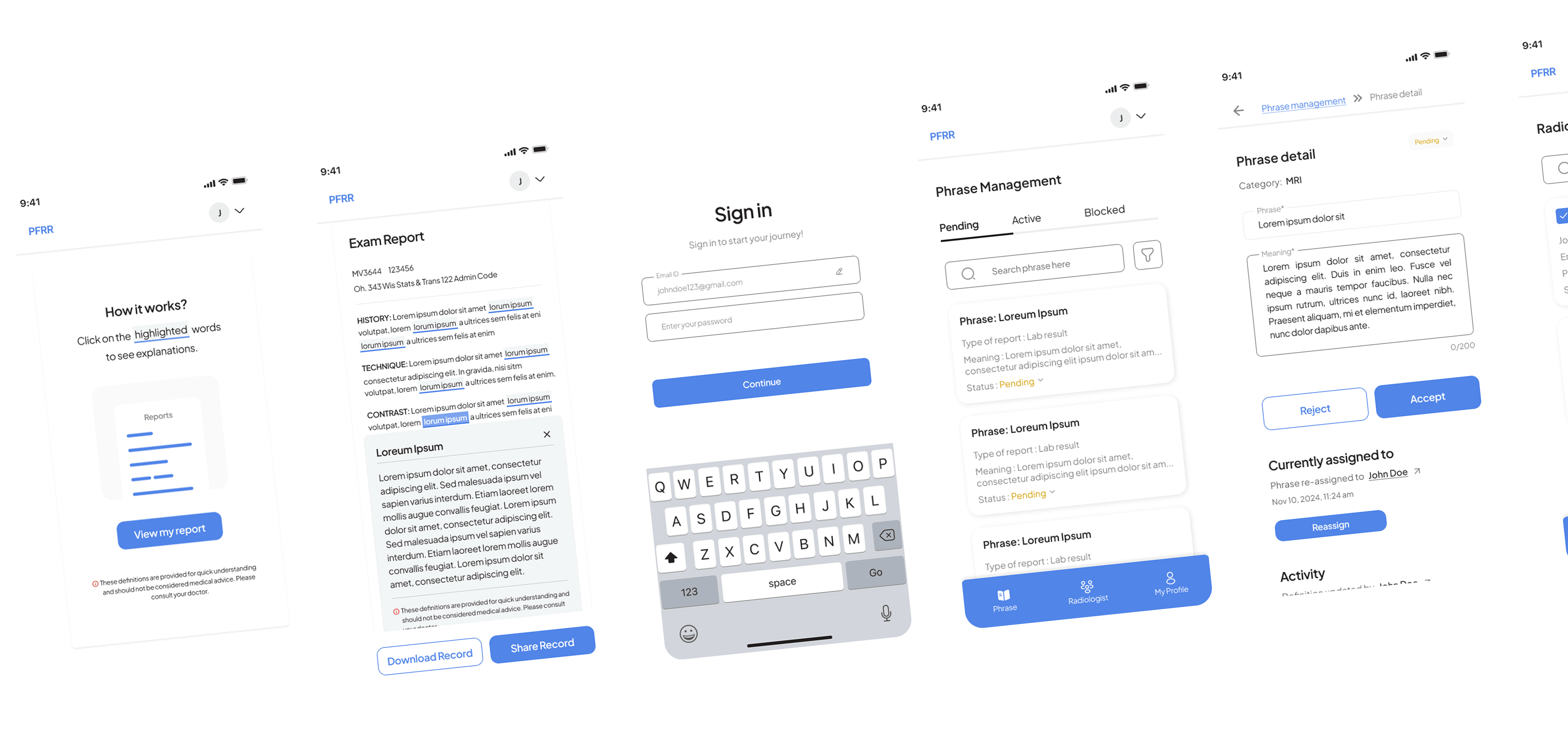
Patient Friendly Portal is an AI-powered web application designed to help patients understand their medical reports with clarity and confidence. Medical documents are often filled with complex terminology, leaving users confused or dependent on others for explanation.
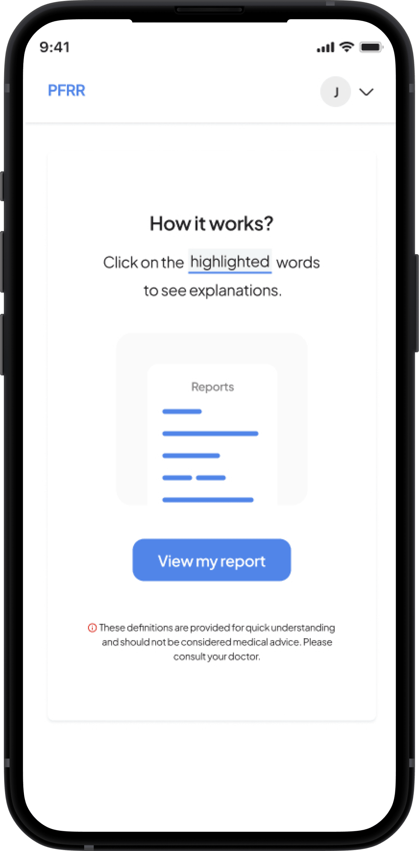
Our solution highlights unfamiliar terms directly within the report and provides simplified, clinically accurate definitions when users click on them.
By transforming dense medical text into an interactive learning experience, the platform reduces anxiety, improves comprehension, and enables patients to take a more active role in their healthcare journey.
Overview
Patient Friendly Portal is an AI-powered web application designed to help patients understand their medical reports with clarity and confidence. Medical documents are often filled with complex terminology, leaving users confused or dependent on others for explanation.
Our solution highlights unfamiliar terms directly within the report and provides simplified, clinically accurate definitions when users click on them.
Read More
Tech stack
Figma
Firebase
React
OpenAI
GCP
High Level Goals
01
Build a trustworthy, insight-driven experience that empowers users to act confidently in dynamic market conditions.
02
Design a seamless, mobile-responsive interface that provides clear alerts, trend analysis, and performance tracking for retail investors.
Initial Challenges
Medical reports are dense, technical, and written for clinicians—not patients. Our primary challenges included:
Breaking down highly technical terms into short, accurate, and non-misleading explanations.
Locating and highlighting terminology automatically across diverse report formats.
Ensuring accessibility, especially for users unfamiliar with digital platforms or medical language.
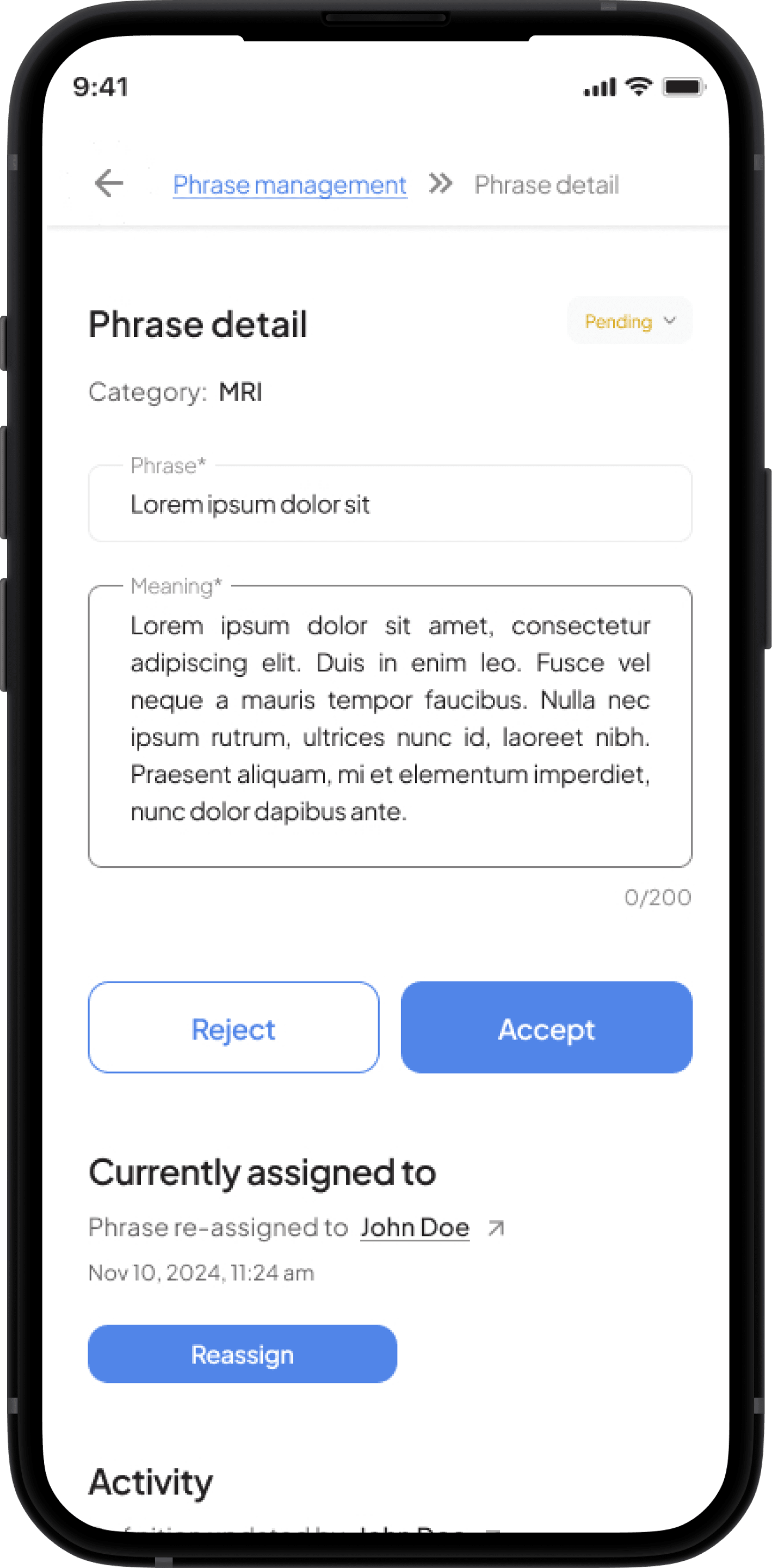
Managing context-aware definitions, as some terms change meaning based on body part or modality.
Solving these required a careful balance between design clarity, domain accuracy, and system intelligence.
Research & Brand Immersion
We studied:
Real radiology, pathology, and health check-up reports across formats
Patient behavior patterns while navigating medical documents
Health literacy challenges common in India
Existing solutions such as WebMD, MyChart, and Google Health cards
Key insights from user interviews revealed:
Patients want quick, simple explanations, not long medical paragraphs.
Confidence increases when information looks clean, credible, and AI-assisted.
Trust is tied to design quality and tone of language—too casual feels unsafe; too technical defeats the purpose.
The brand direction was built around calm colors, soft gradients, medical precision, and a reassuring visual tone.
Strategy
The product strategy was built on three core pillars:
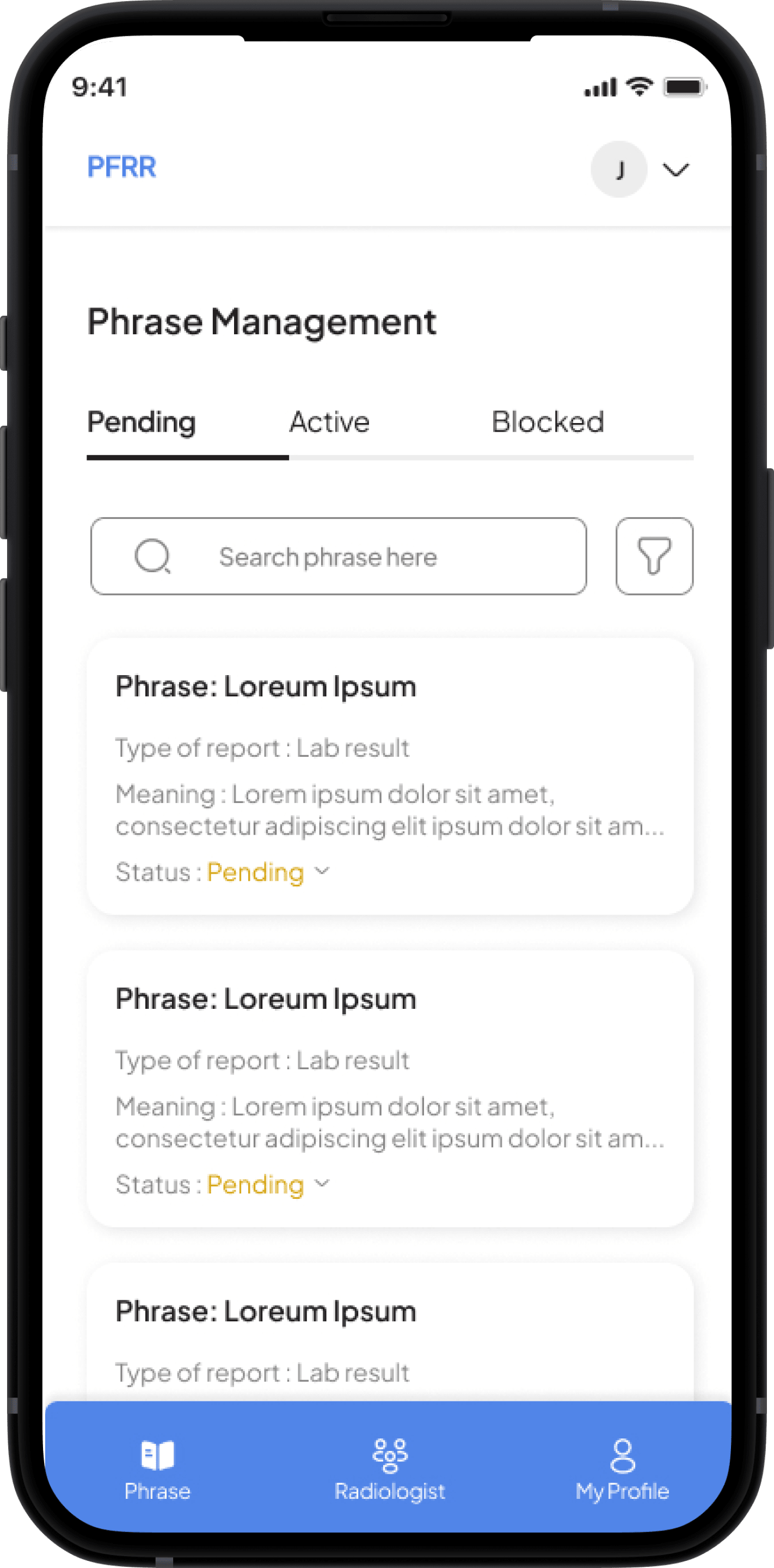
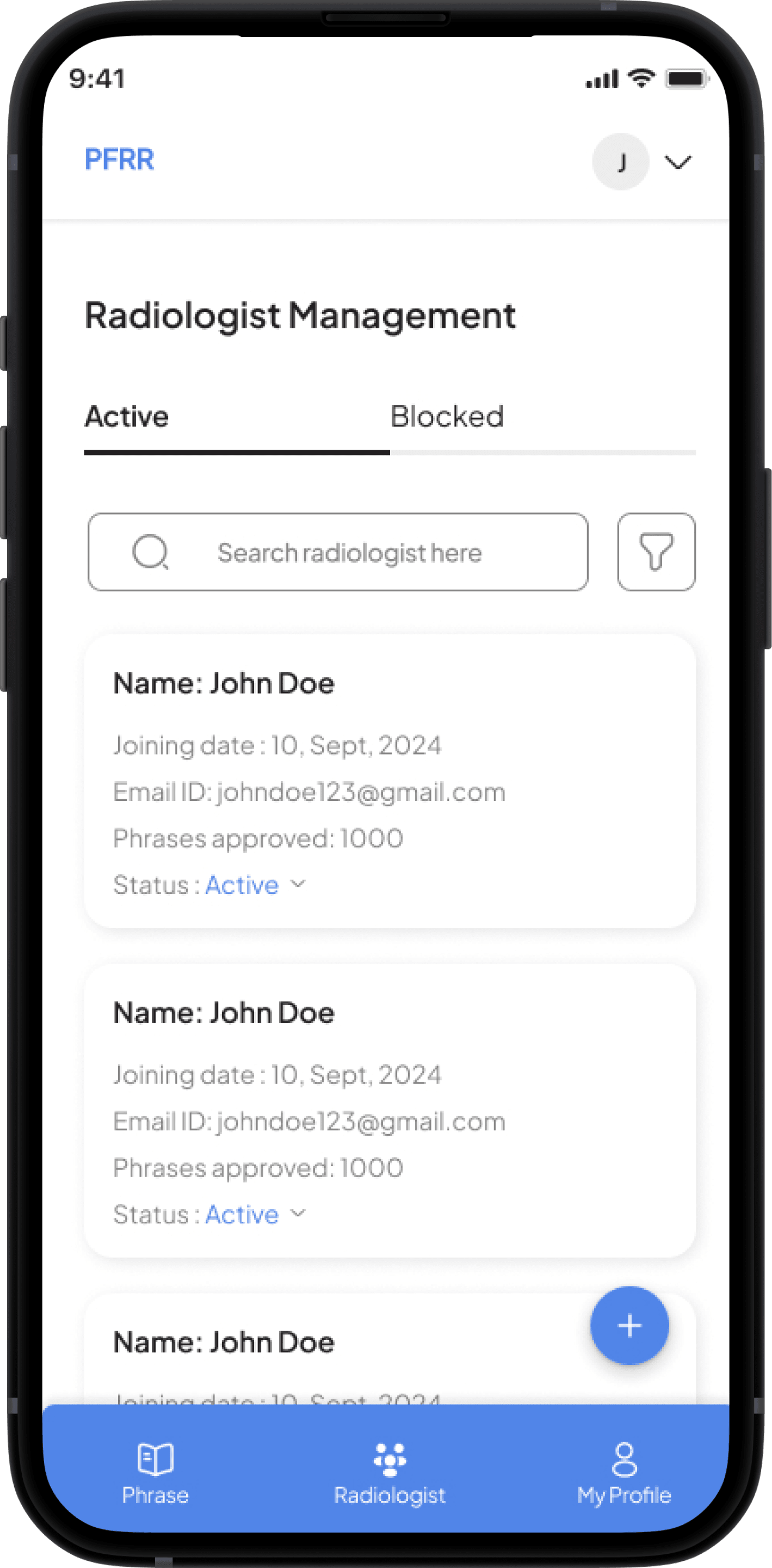
Informative Provide clear, contextual, and clinically correct definitions for thousands of medical terms.
Interactive Highlight complex words and allow one-tap access to explanations, example images, and additional AI-backed insights.
Patient-Centric Create a flow that feels simple, non-intimidating, and accessible, regardless of age or medical familiarity.
Additional engagement ideas included:
Saving explained reports for future reference
Shareable insights for family members or physicians
Optional voice-based explanation for accessibility
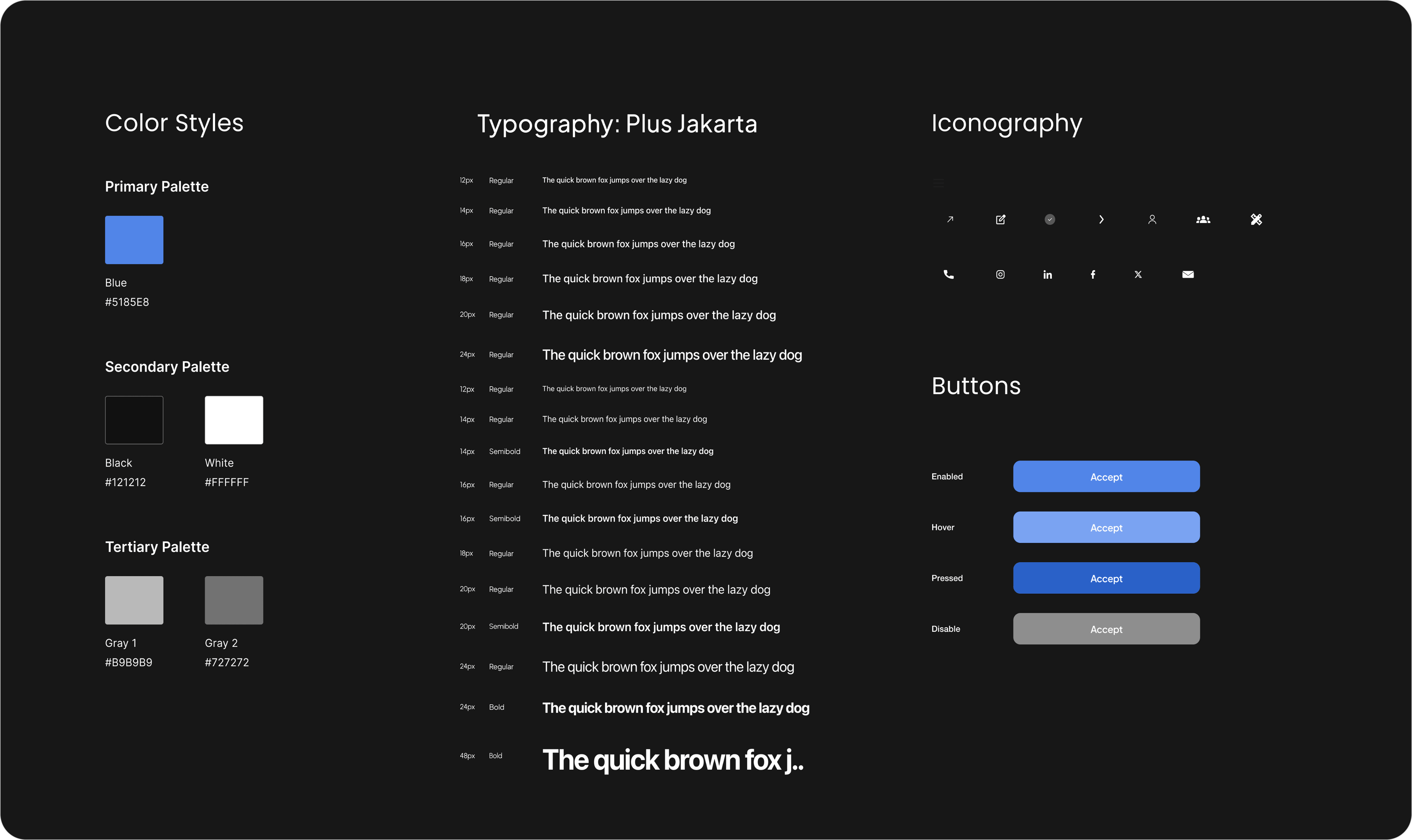
Design Guide
The design system focused on clarity, minimalism, and medical trust:
Soft blue tones to evoke calmness and reliability
Clean typography optimized for readability of long documents
High-contrast highlight elements to emphasize clickable terms
Consistent spacing and structured hierarchy to simplify dense content
Smooth micro-interactions to enhance the learning experience
The tone of content was crafted to be empathetic, neutral, and reassuring, avoiding fear-inducing or overly clinical language.
Loading image...
Implemented Work
Incorporating all visual elements like colors, fonts, icons, and imagery, along with realistic designs and functionalities of the platform.
Loading image...
Customer Side
The customer interface of Market Minds embodies intuitive financial intelligence through a meticulously crafted user experience. Built with a mobile-first approach, the platform features clean card-based layouts that prioritize critical information hierarchy. A smooth animations guide users through market trends, while color-coded signal indicators (green for buy opportunities, amber for hold recommendations, red for exit alerts) provide instant visual clarity. Every interaction, from swiping through blogs to accessing detailed research reports, is designed to minimize cognitive load, ensuring users can make informed investment decisions quickly and efficiently across all devices.
Loading image...
Loading image...
Loading image...
Loading image...
Loading image...
Loading image...
Loading image...
Admin Side
Kwizzle provides a user-friendly interface that allows learners to dive into mythological tales effortlessly. The platform caters to different learning styles by incorporating text-based content, animations, and quizzes. The progress tracking feature ensures users stay motivated, while social integration allows for knowledge-sharing and community interaction.
Loading image...
Loading image...
Loading image...
Loading image...
Loading image...
Loading image...
Loading image...
Loading image...
The Outcome
Market Minds delivered a refined platform that translates complex financial research into accessible, actionable intelligence. Early user feedback highlights increased confidence, improved trade timing, and overall satisfaction with the alert system. The clean UI and consistent updates make it a go-to companion for self-directed investors.
Key Learnings
Minimal UI paired with strong data wins user trust Users prefer alerts that are precise, timely, and explain the why Regulatory transparency (via T&Cs and investor charter) adds credibility Personalized delivery channels (WhatsApp, SMS, App) improve retention
Liked what you saw?
We craft seamless digital experiences that bring ideas to life. Whether it's UX/UI design, web development, or custom solutions, we’re here to turn your vision into reality.
🚀 Let’s build something great together!
Look what they made us do
Our work? It's like comparing 'Apples' to, well, something really 'Awesome'.
1
Track My Care
Track My Care
Access medical reports securely anytime via cloud storage. Effortless!